Properties — content management at scale
I shipped the features. I skipped the system.
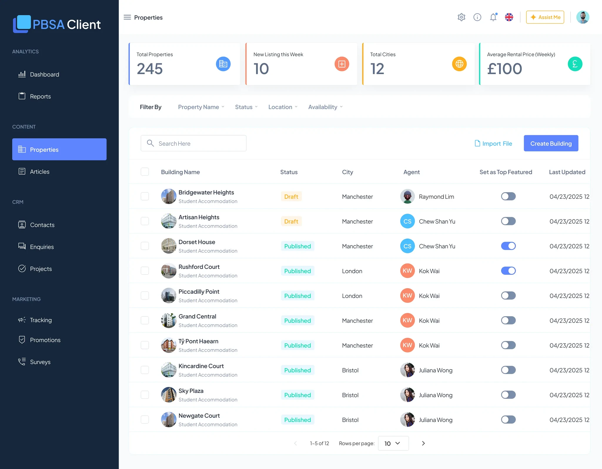
Property data lived in three places: the CRM (Yardi), the WeChat backend, and marketing spreadsheets. Every update had to be manually synced. Publishing a new property took four hours or more.
This module needed to centralize everything — and it does. But I built it without a component library, so every feature became bespoke. The result works, but it cost more than it should have.
The real problem
There was no source of truth. Everything downstream of that was repetitive, manual work.
- Scattered data
- Property details in Yardi, images in marketing folders, availability in spreadsheets. No single source of truth.
- Manual sync hell
- Update a room price in Yardi? Manually update WeChat. New photos? Manually re-upload to the Mini Program. Hours of repetition.
- No asset reuse
- Every property needed new photos. No way to reuse a bedroom shot across buildings — wasted storage, inconsistent branding.
- Manual onboarding
- A new client with 20 properties meant importing them one by one. No CSV import, no templates.
- Data quality
- Without validation, properties went live incomplete — missing photos, wrong pricing, inconsistent formatting.
What I shipped
- Central database All properties in one place — filterable by city, status, and room type.
- CSV bulk import Upload multiple properties at once. Smart defaults cut down manual data entry.
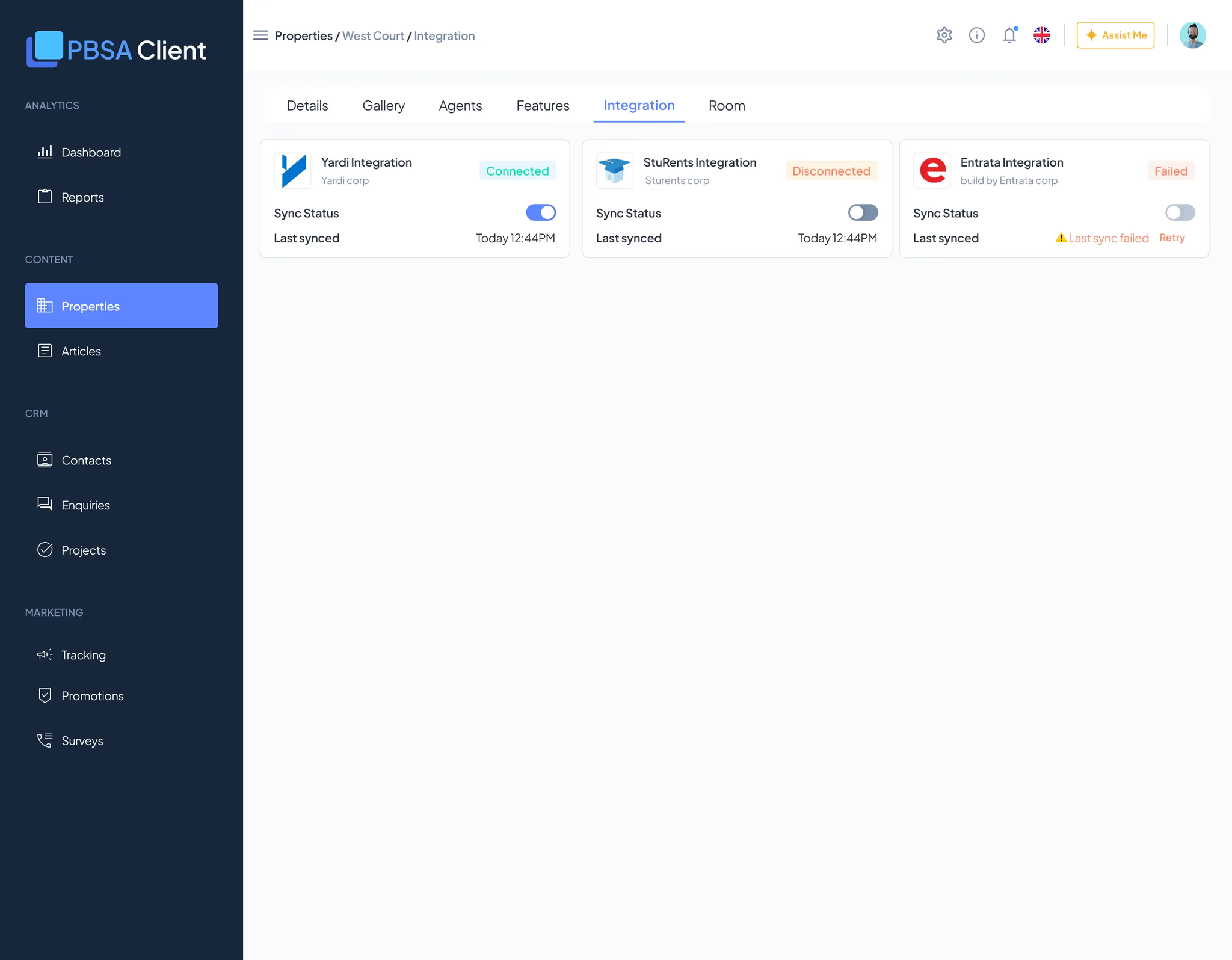
- CRM integration Sync from Yardi / StuRents, but flag items for manual review before publishing.
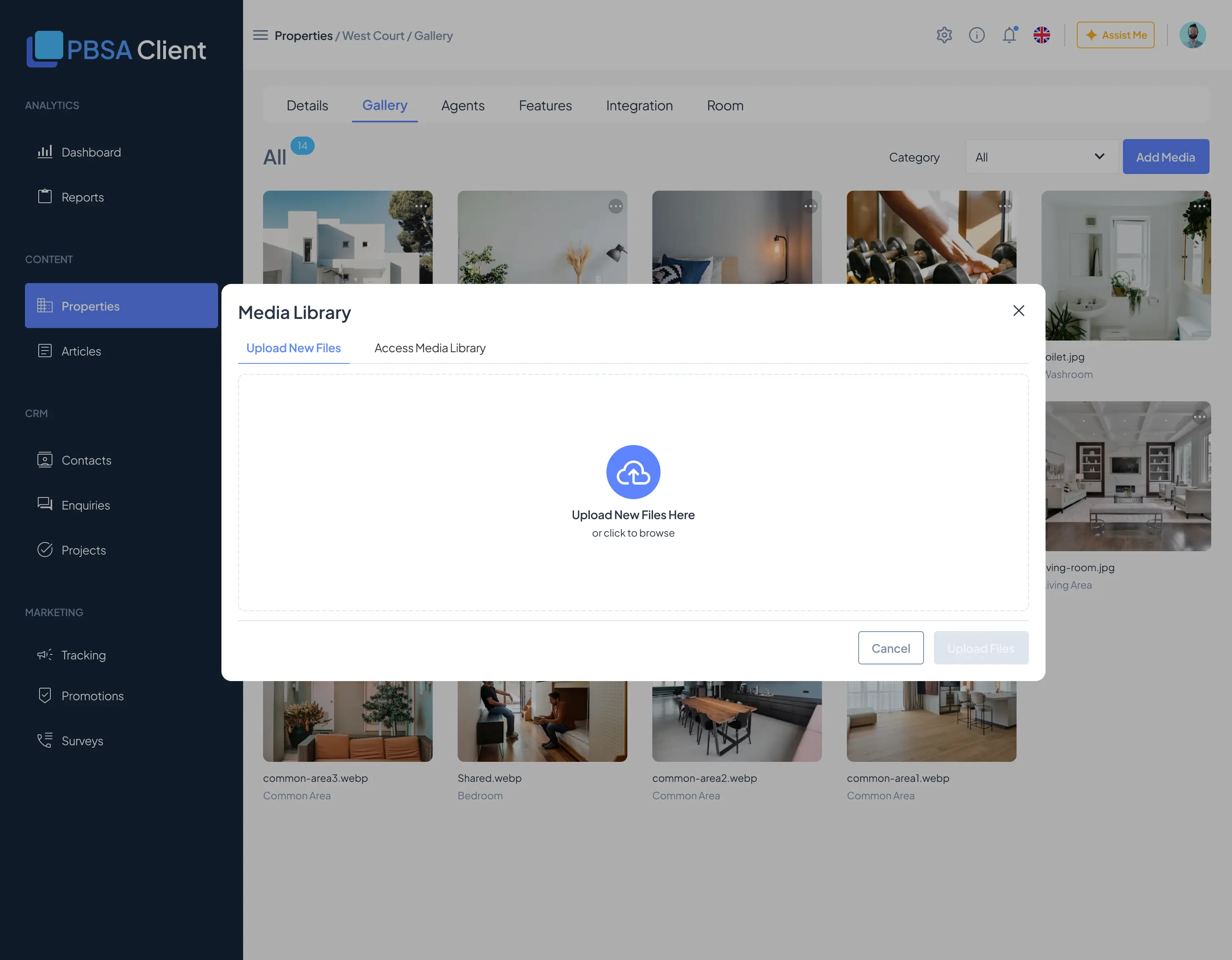
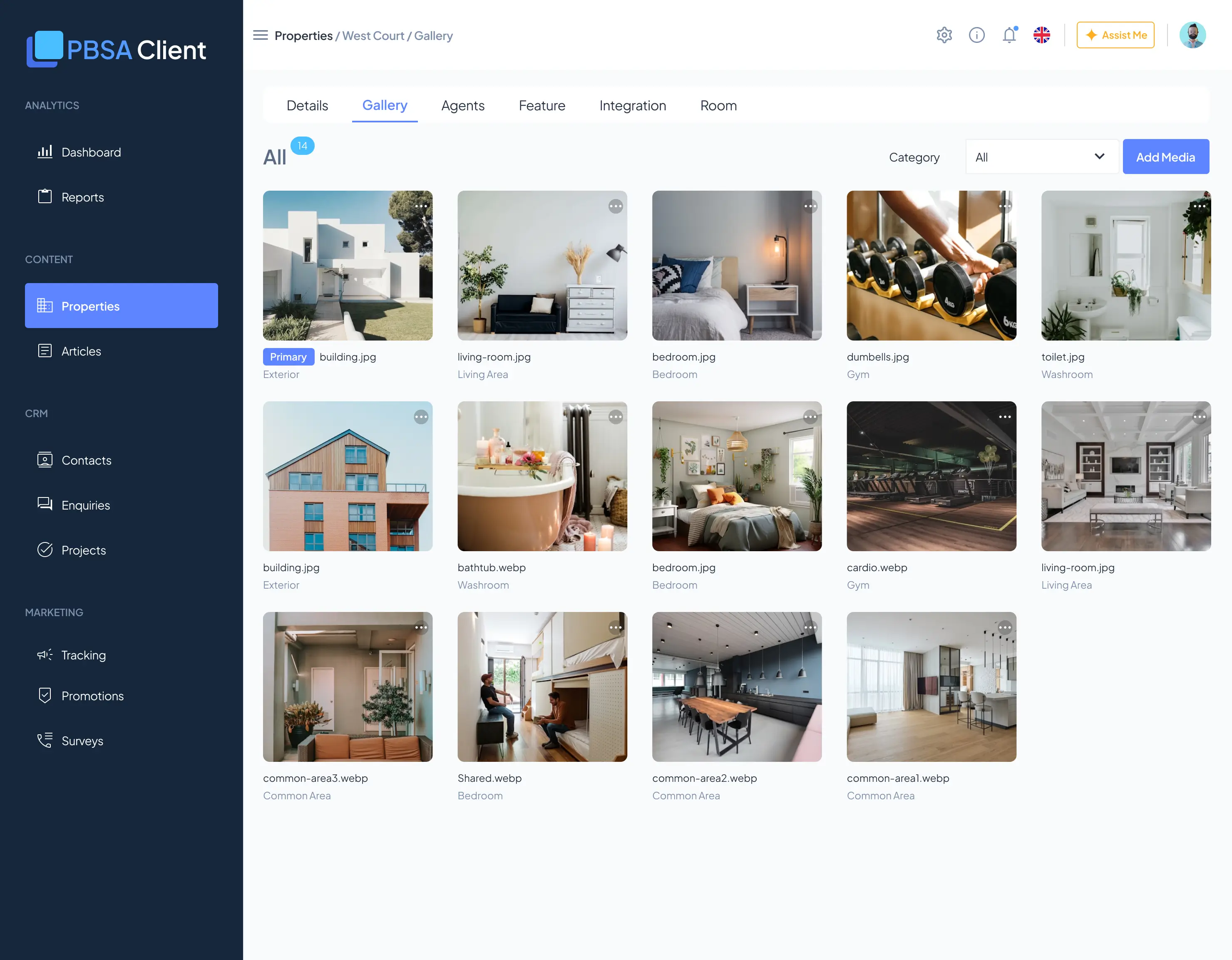
- Shared gallery Upload once, reuse across properties. Tag images by room type or area.
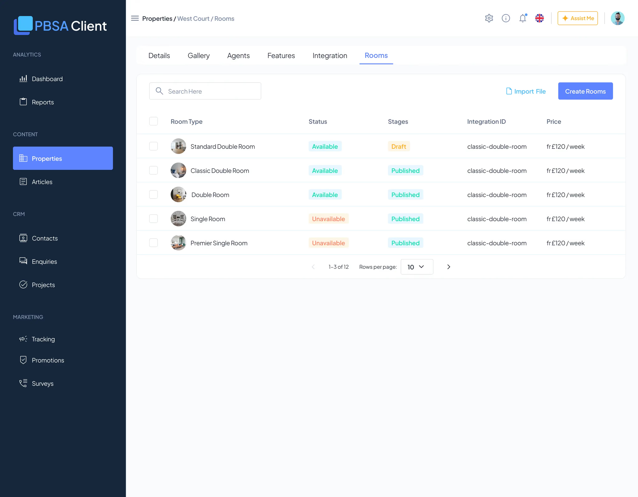
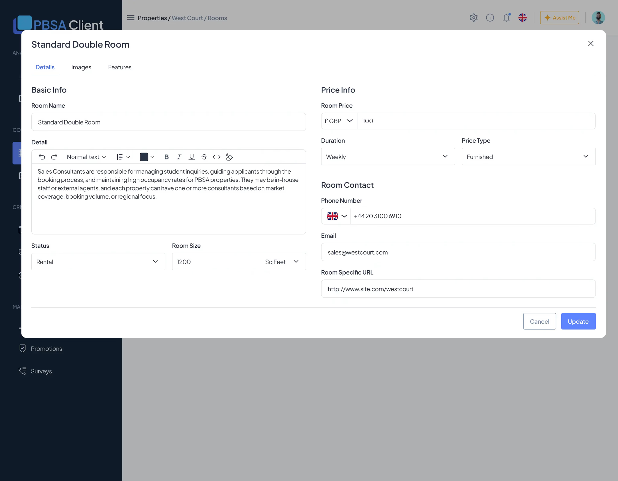
- Room management Define room types, pricing, availability, and capacity — reusable across properties.
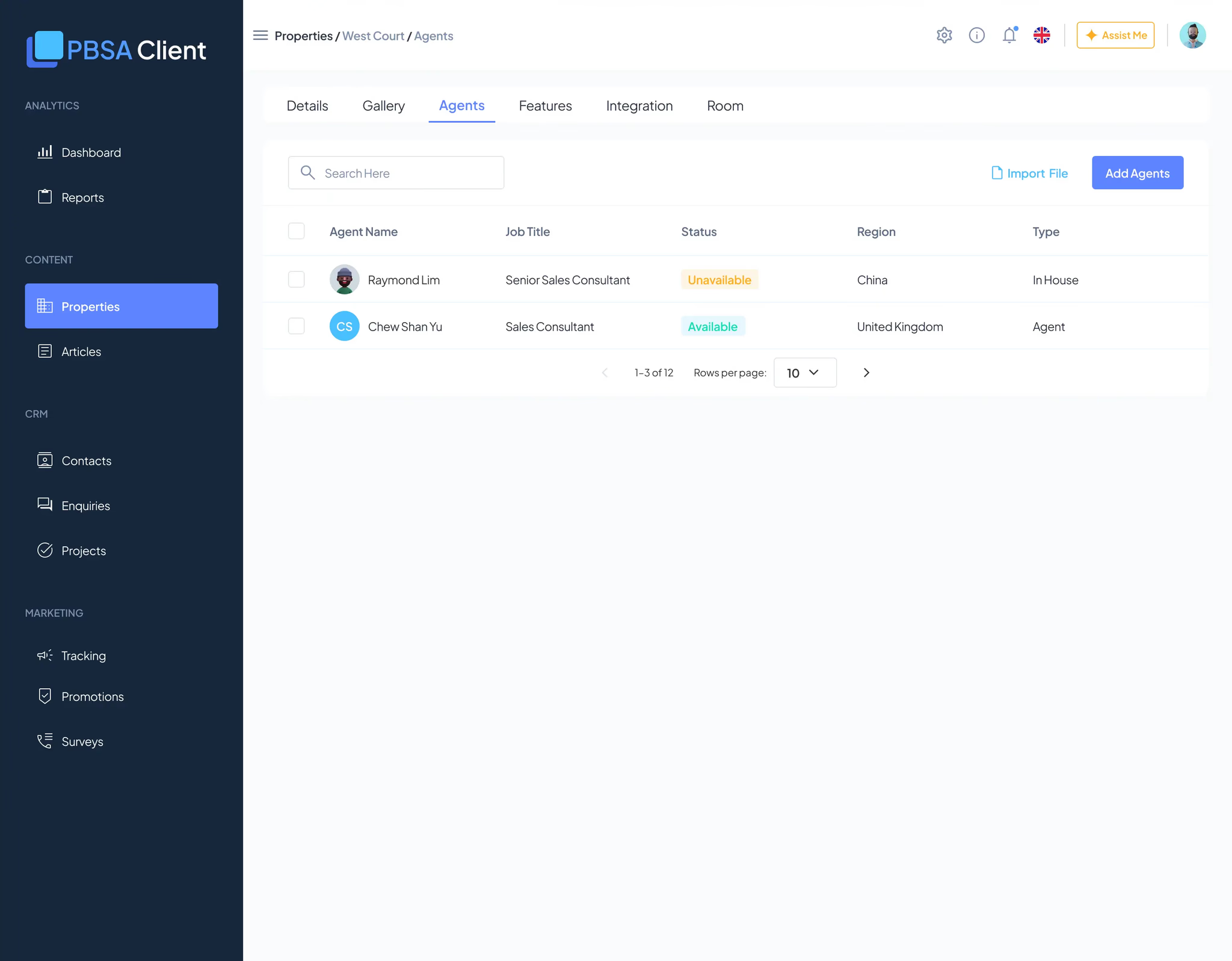
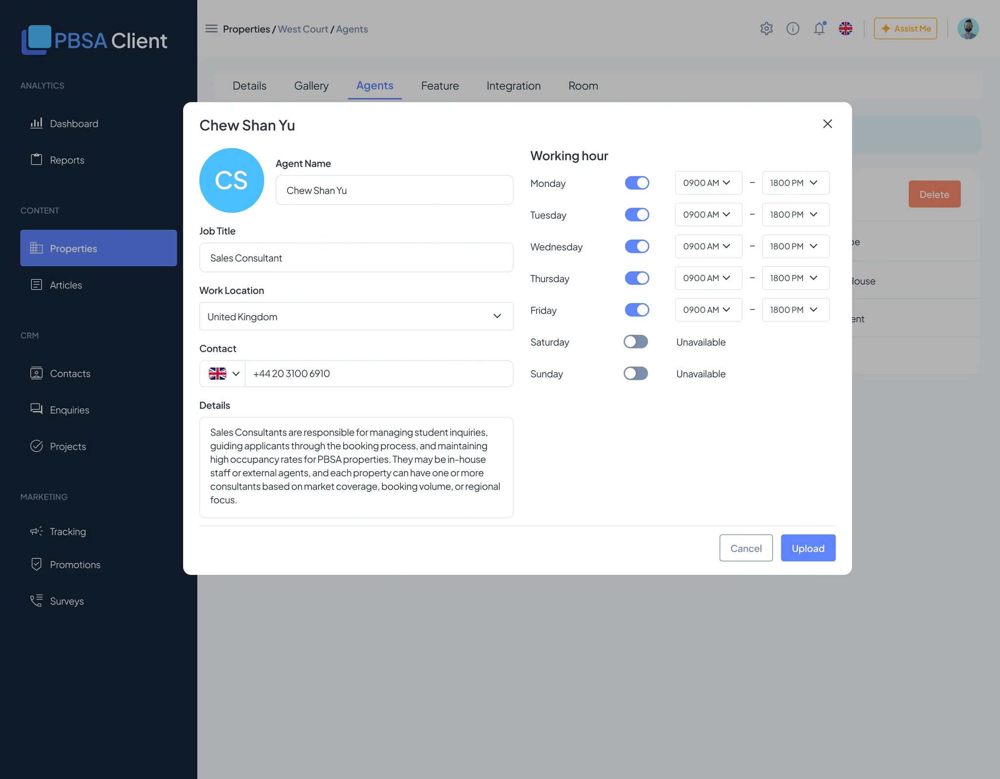
- Agent assignment Assign consultants to properties, with working-hours scheduling.
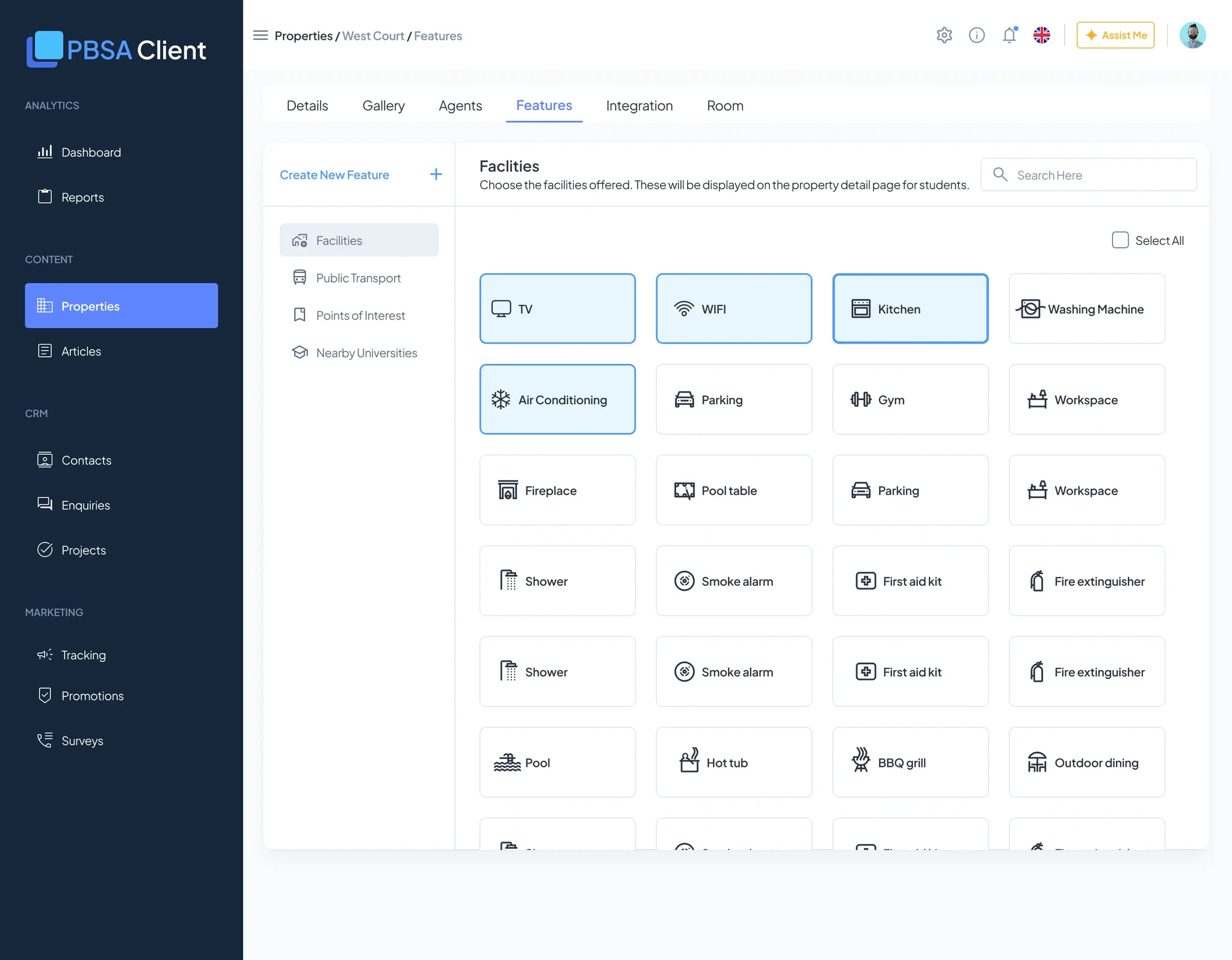
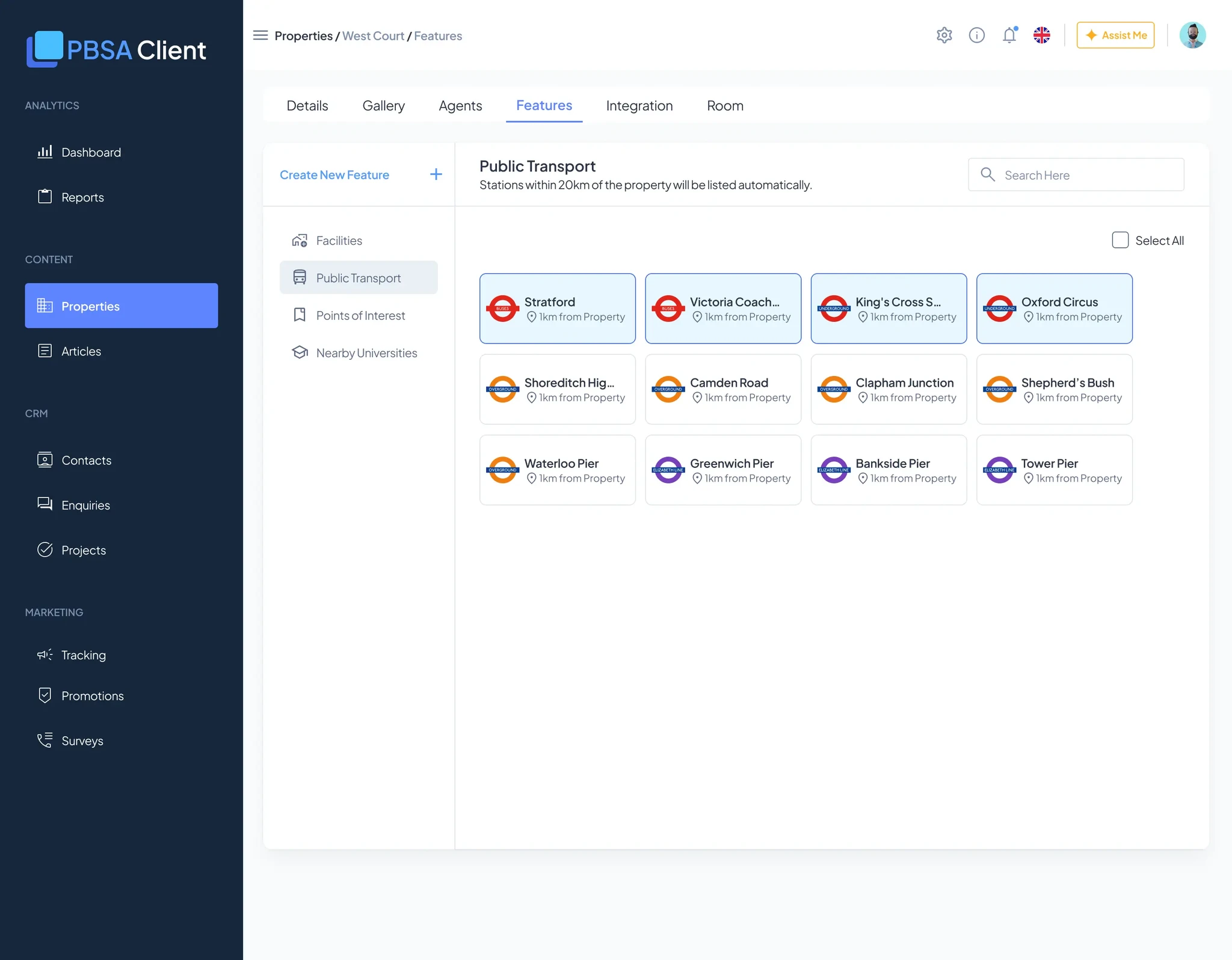
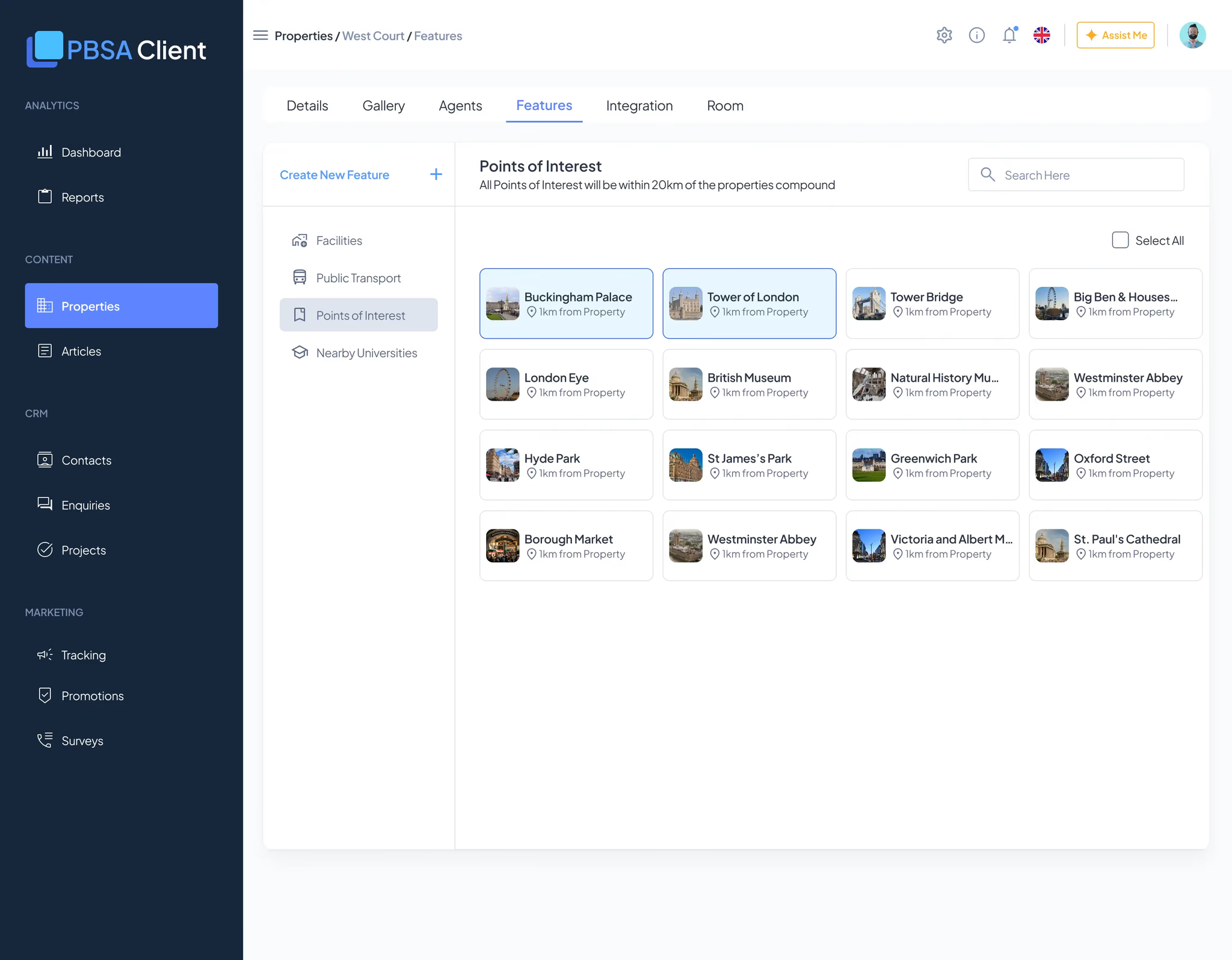
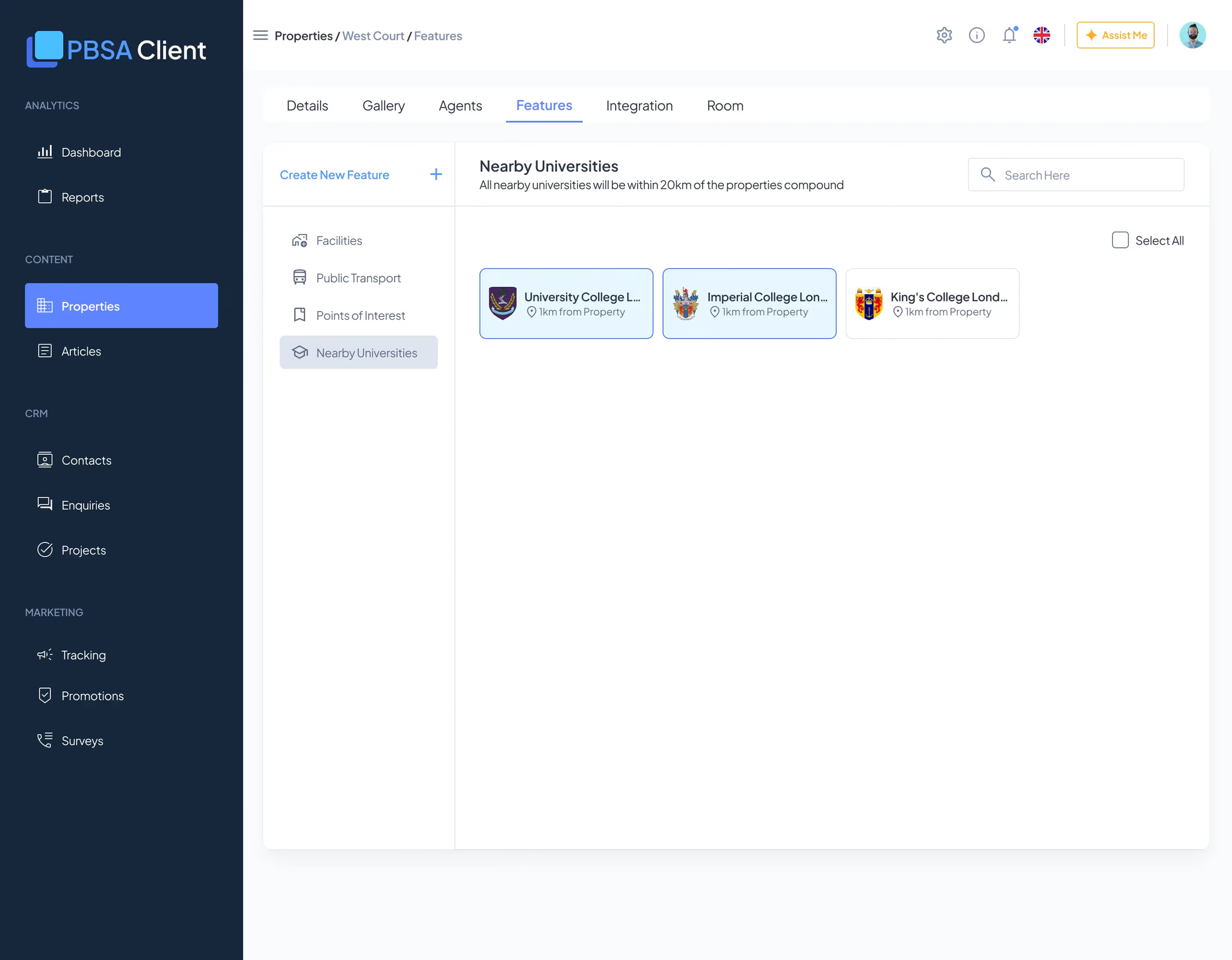
- Feature tagging Mark amenities and nearby landmarks. Searchable and standardized.
The design system debt
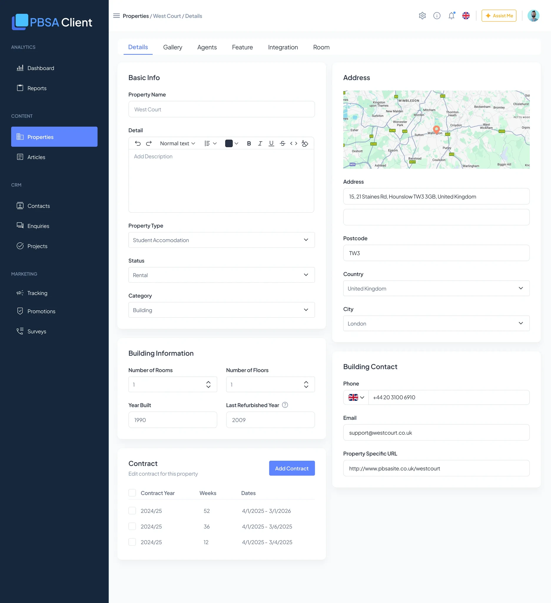
I built this module without a shared component library. Each tab — Gallery, Rooms, Agents, Features — needed custom form layouts, unique input patterns, and bespoke validation.
The Gallery alone has four different UI states, each designed and coded from scratch:
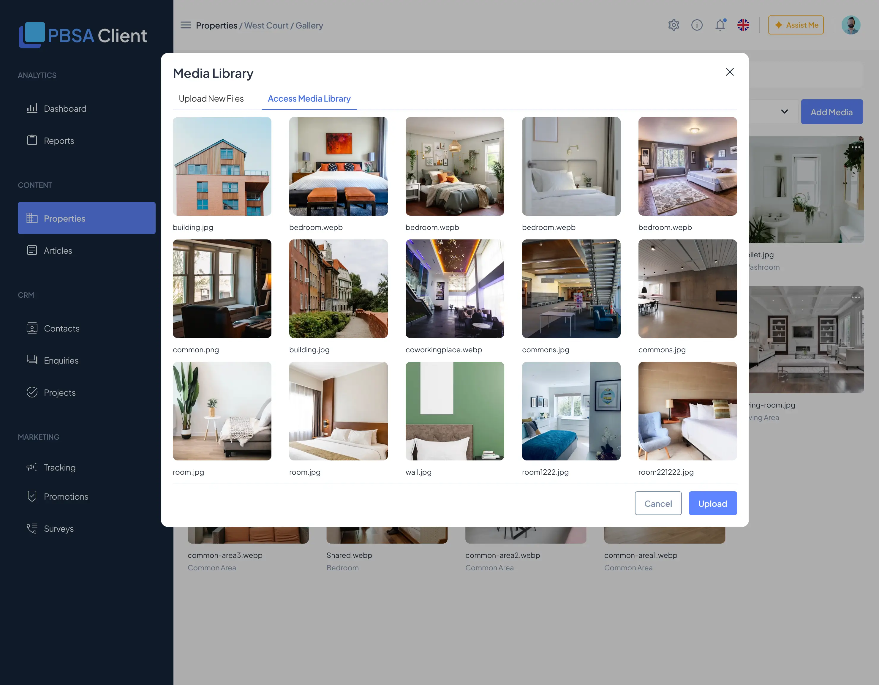
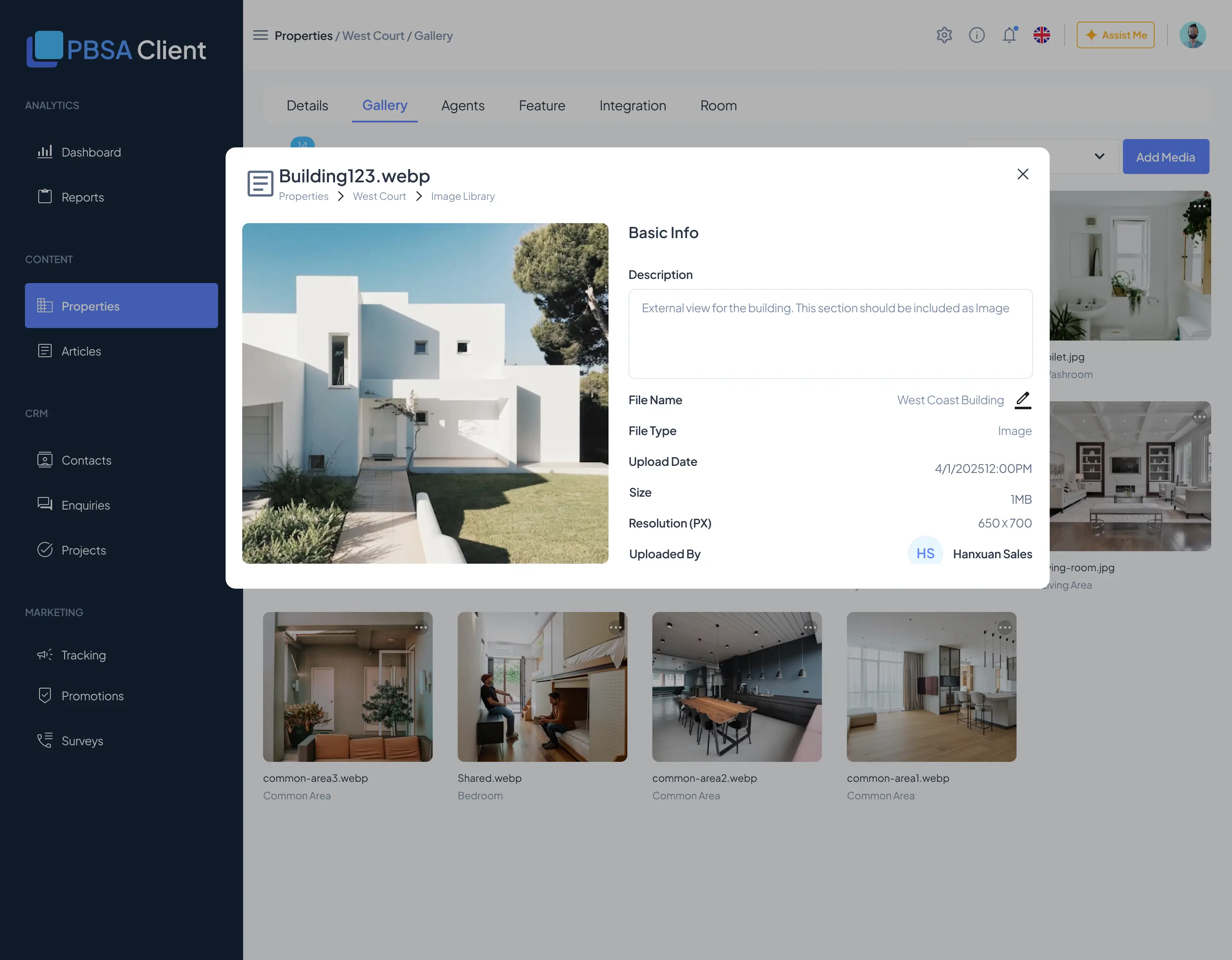
Because I didn't have
- Reusable form components
- Consistent input styling
- Shared upload patterns
- Standard table layouts
…every screen needed custom design and custom code. Had a component library existed first:
- Faster
- Gallery would have taken roughly 40% less time to design and build.
- Consistent
- The UI would have matched the Enquiries module instead of drifting from it.
- Composable
- Rooms, Agents, and Features would have snapped together rather than being rebuilt.
Instead I designed each tab, shipped without a system, and left developers to interpret consistency.
What actually works
CSV import. Operators with 50+ properties can upload a spreadsheet instead of keying them in one by one. It paid for itself immediately.
CRM integration with manual review. I initially pushed back on the review checkpoint — stakeholders wanted full automation ("just sync everything"), and I worried it would bottleneck the workflow. It turned out to be the right call.
The manual review caught
- Duplicate room types — one property had three copies of "Standard Double".
- Missing pricing data before it went live.
- Naming inconsistencies across Yardi fields.
Post-launch, stakeholders admitted: "Glad we didn't skip this."
Shared gallery. Reusing photos across properties became the default workflow. Operators upload brand-standard photos once and reuse them — quality went up, upload time went down.
Feature tagging. Operators lean on this for search. "Rooms with gym access near transport" — the tags make those queries work in the Mini Program.
Each of these tabs was a fresh layout problem — not a configuration of shared parts.
The honest reflection
This module ships. It works. Operators use it daily. But it carries unnecessary complexity, because each feature tab was designed in isolation.
If I redesigned it, I'd reverse the order:
- Build a component system first — form inputs, tables, filters, modals.
- Then design the modules — Gallery, Rooms, Agents become config views on the same patterns.
- Then build — developers implement consistent UI across every tab.
Instead, I designed each tab independently, shipped without a system, and left developers to interpret consistency. It works — but it's expensive to maintain and hard to extend.
This module taught me the difference between two ways of working.
- Feature shipping
- I did this — CSV import, CRM sync, and the shared gallery all work. It feels fast.
- System thinking
- I didn't do this — no shared components, everything bespoke. It feels slow upfront, but saves months later.
At scale — 9+ modules — skipping the system gets expensive. Properties is the proof.
What this taught me about systems
What good looks like:
- We establish design systems before building features.
- Design patterns are enforced across the platform.
- Developers have a component library to reference.
- I'm working alongside a design-system lead, not alone.
That gap — between shipping fast and building well — is what I'm trying to close.